When I find an Instagram page where I can’t stop scrolling I feel I need to share! One painting after the other made me stop and smile.
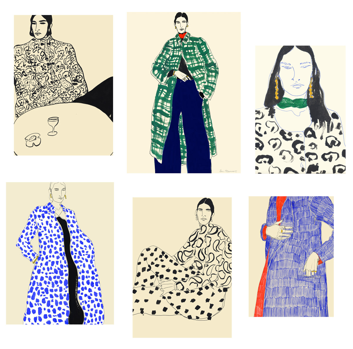
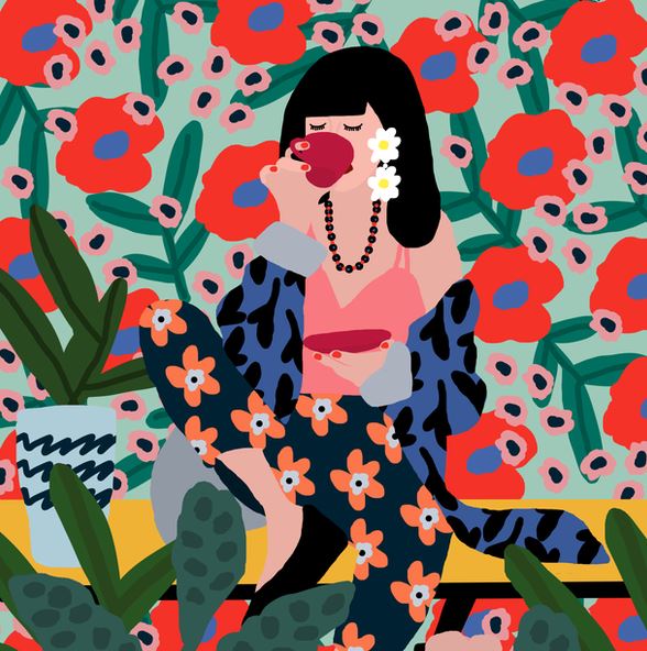
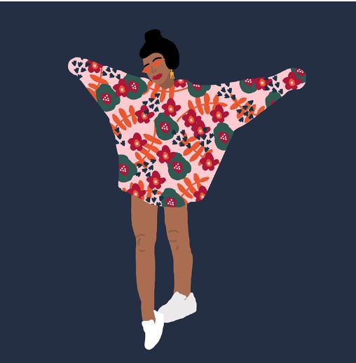
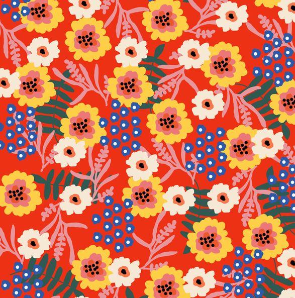
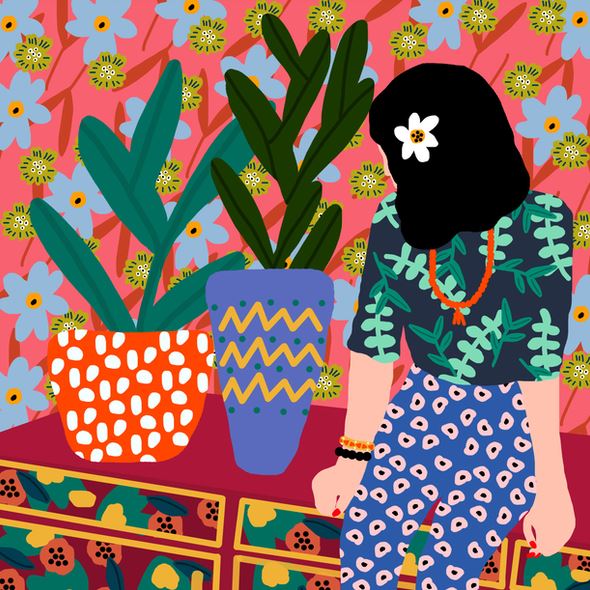
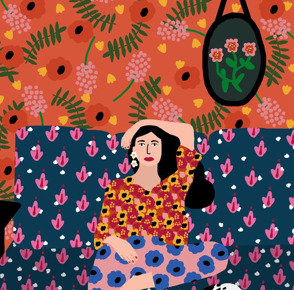
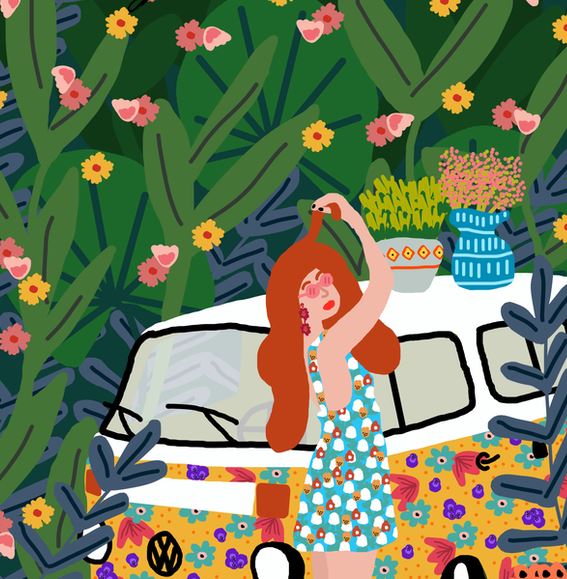
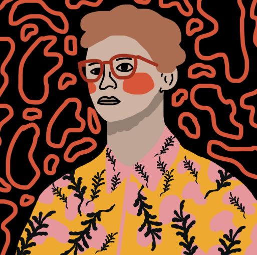
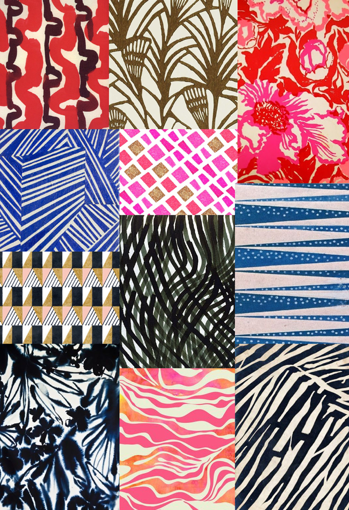
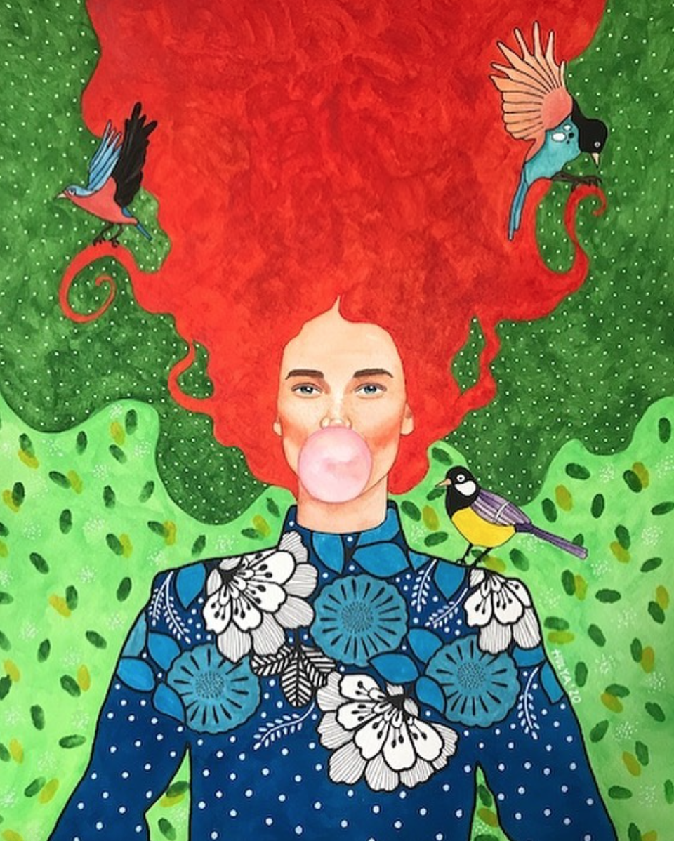
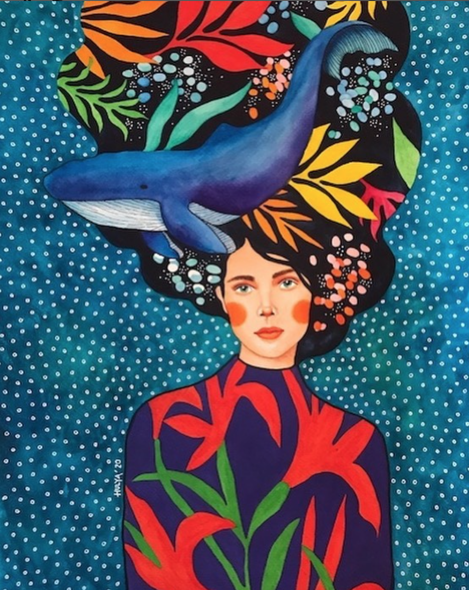
Hülya Özdemir is a Turkish artist from Istanbul who creates incredibly colorful and full of pattern watercolor paintings. The whimsical and beautiful women she portrays have vivid personalities that are full of life. I love her mix of contrasting textures within each piece. The individuality of their expressions, color and various flora and fauna that surround them, gives them vibrant life.
You can see more here.
I am super inspired! Gotta go get my paints out.

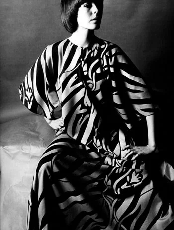
© Hülya Özdemir
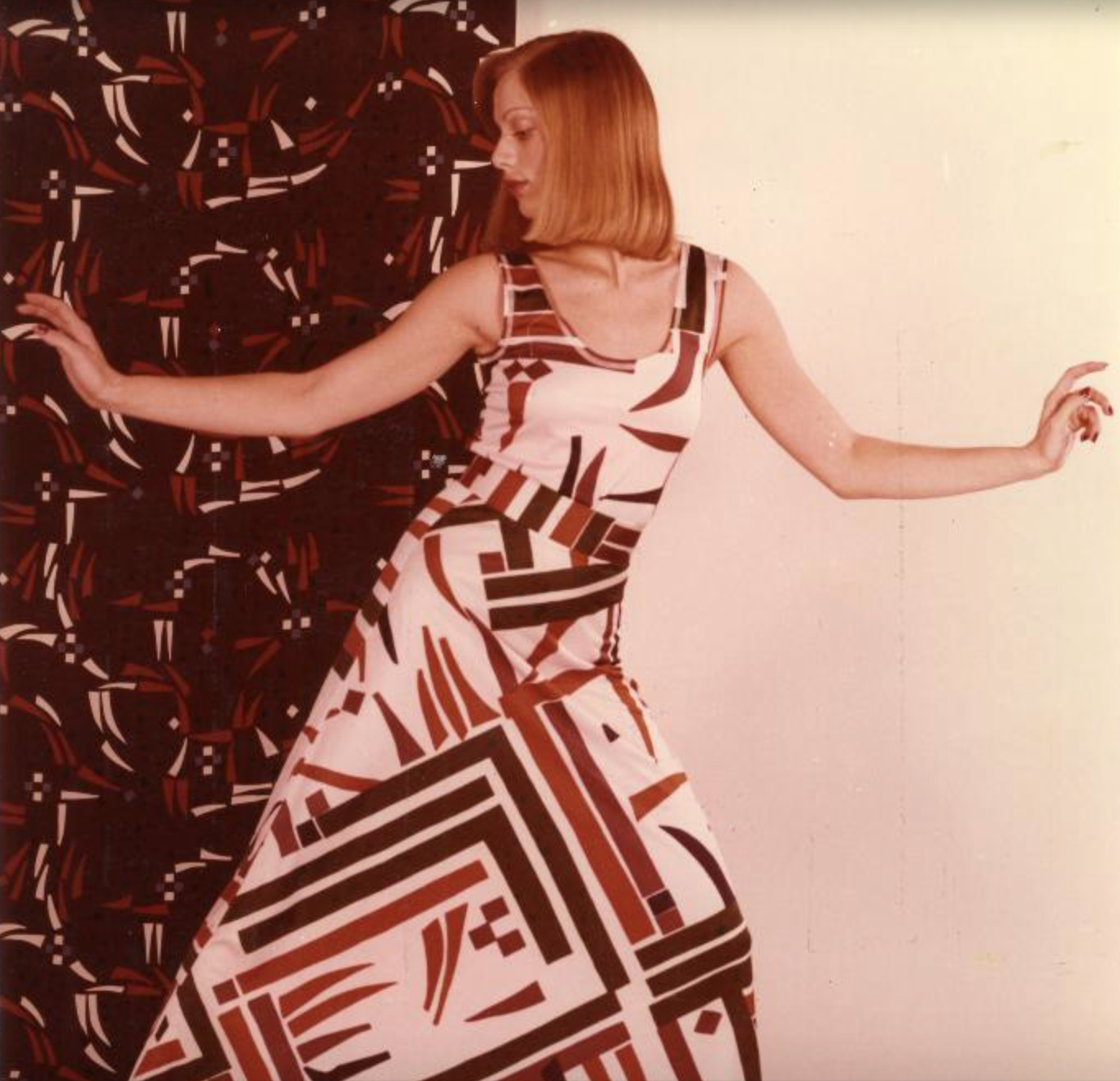
© Hülya Özdemir
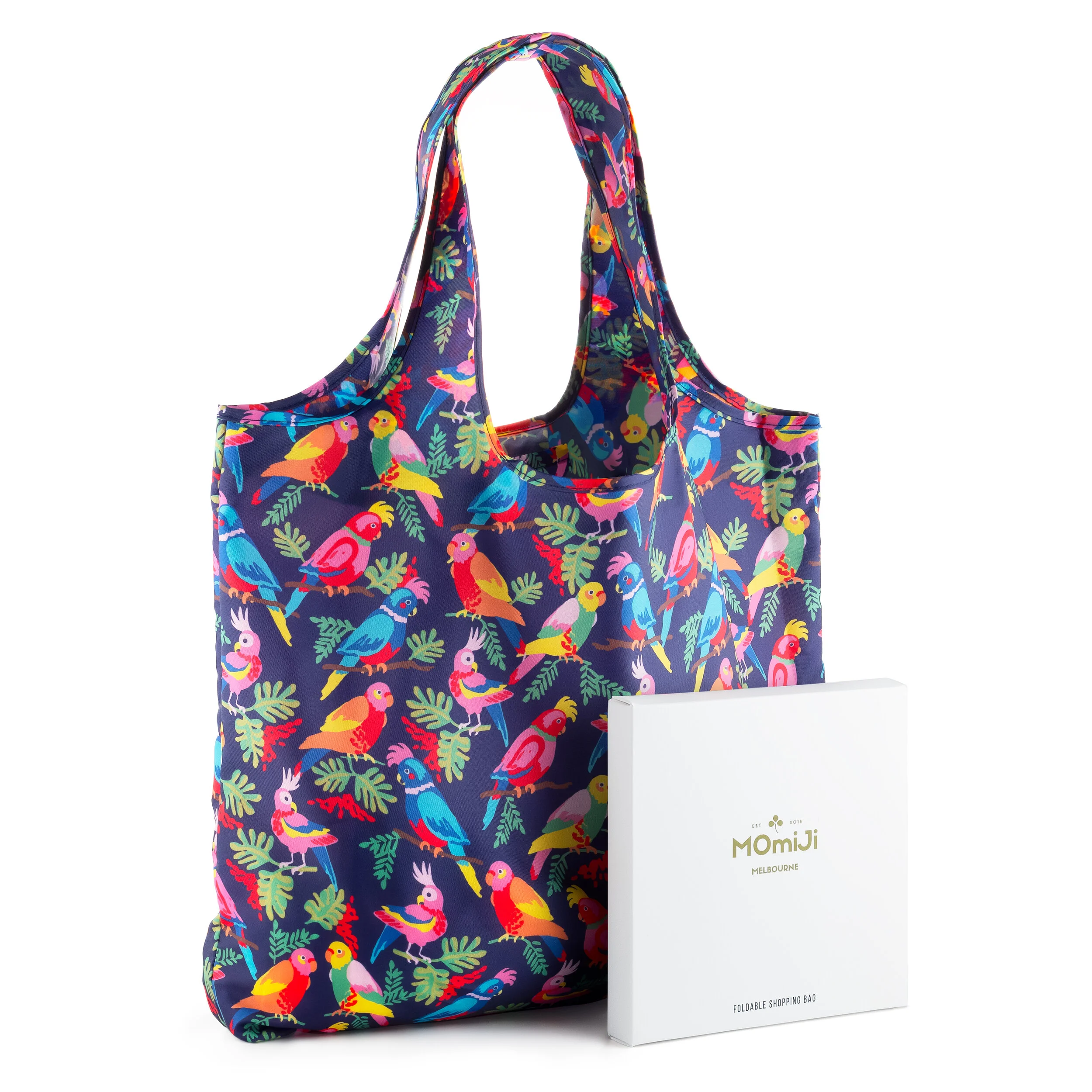
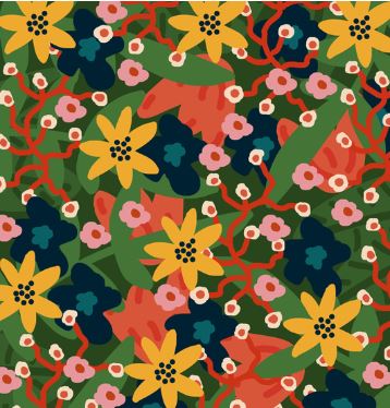
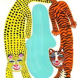
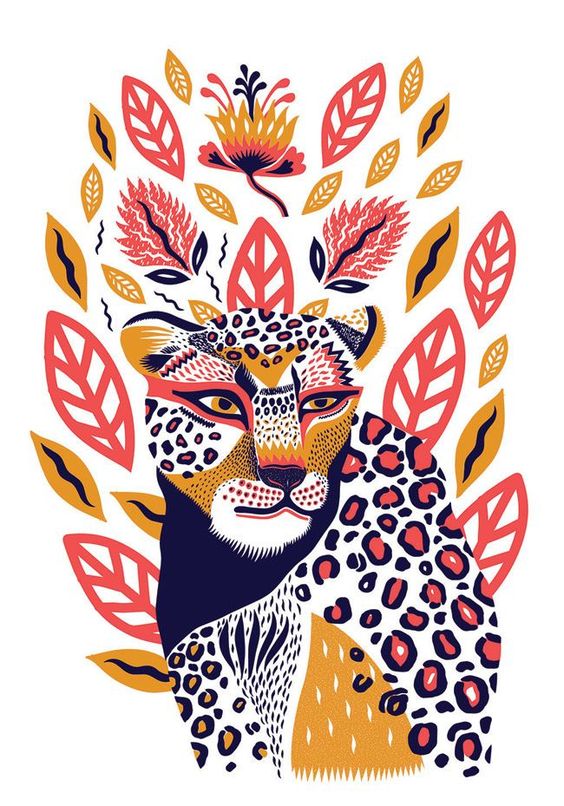
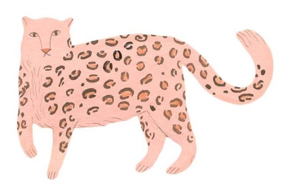
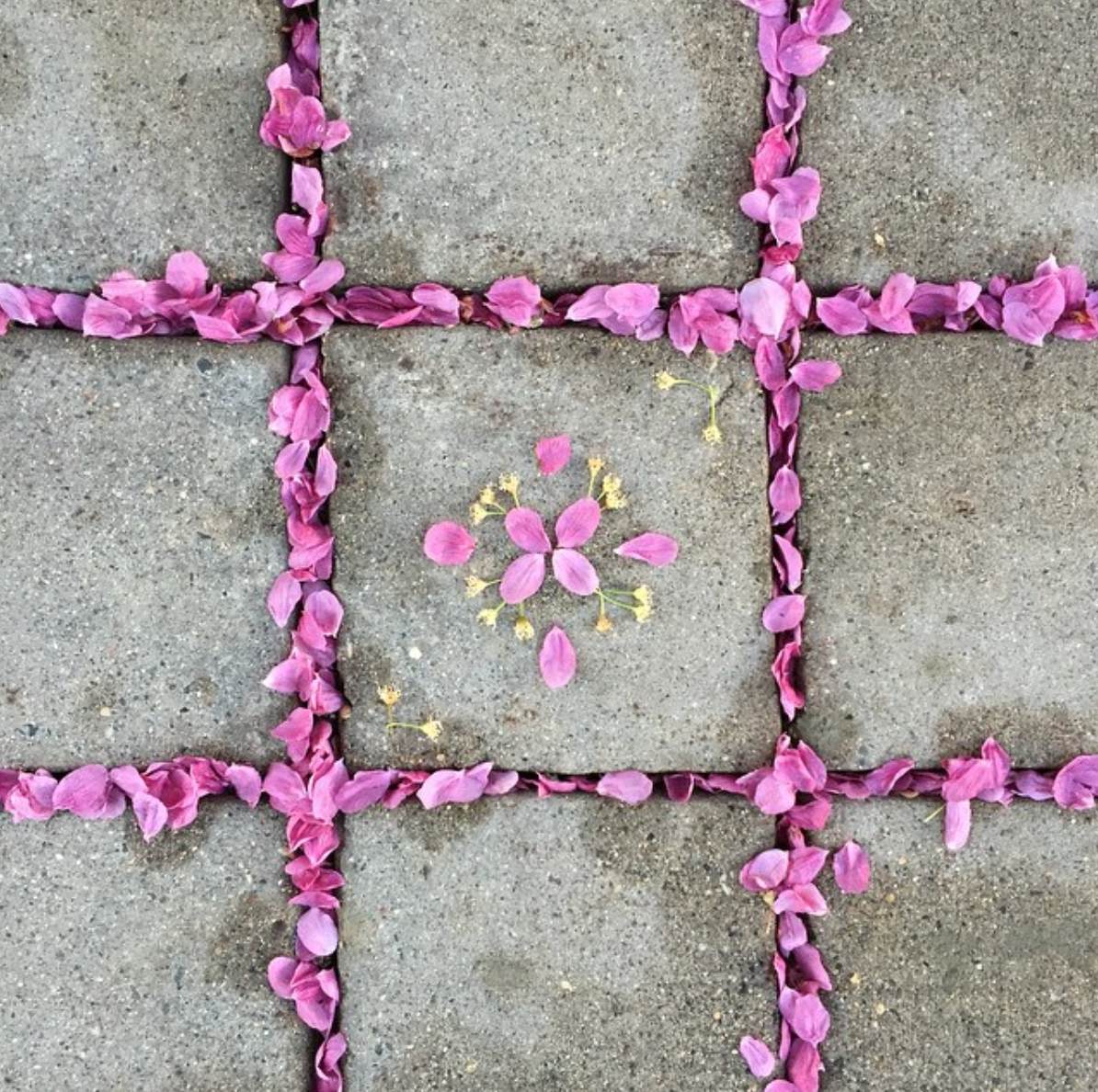
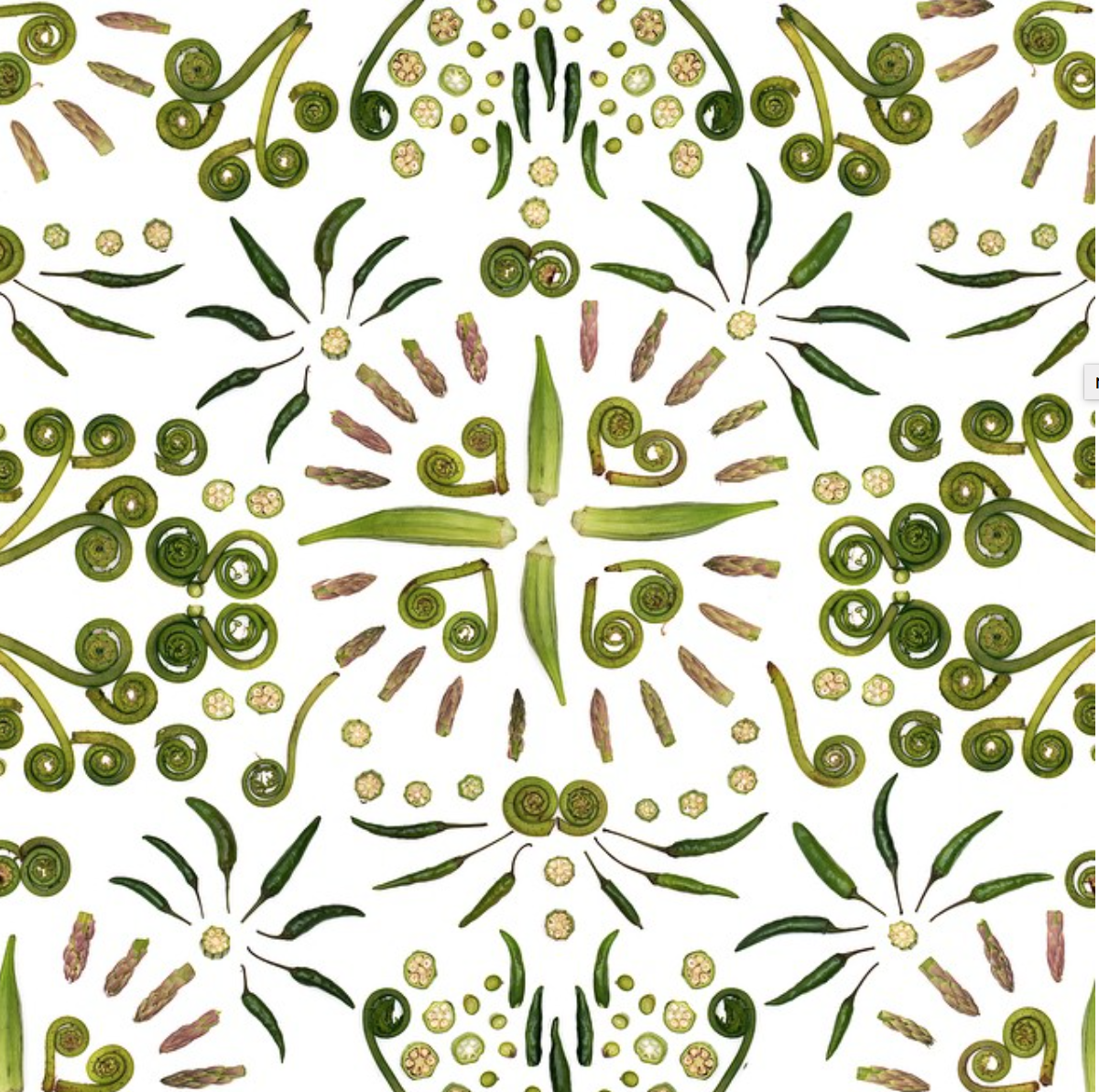
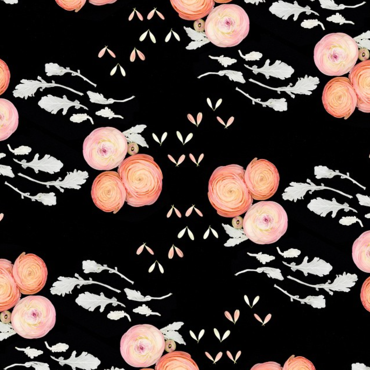
All images in this post are © Hülya Özdemir

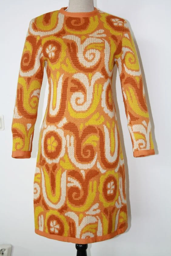
© Hülya Özdemir

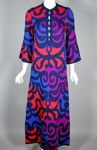
© Hülya Özdemir

© Hülya Özdemir

© Hülya Özdemir

© Hülya Özdemir
© Hülya Özdemir