
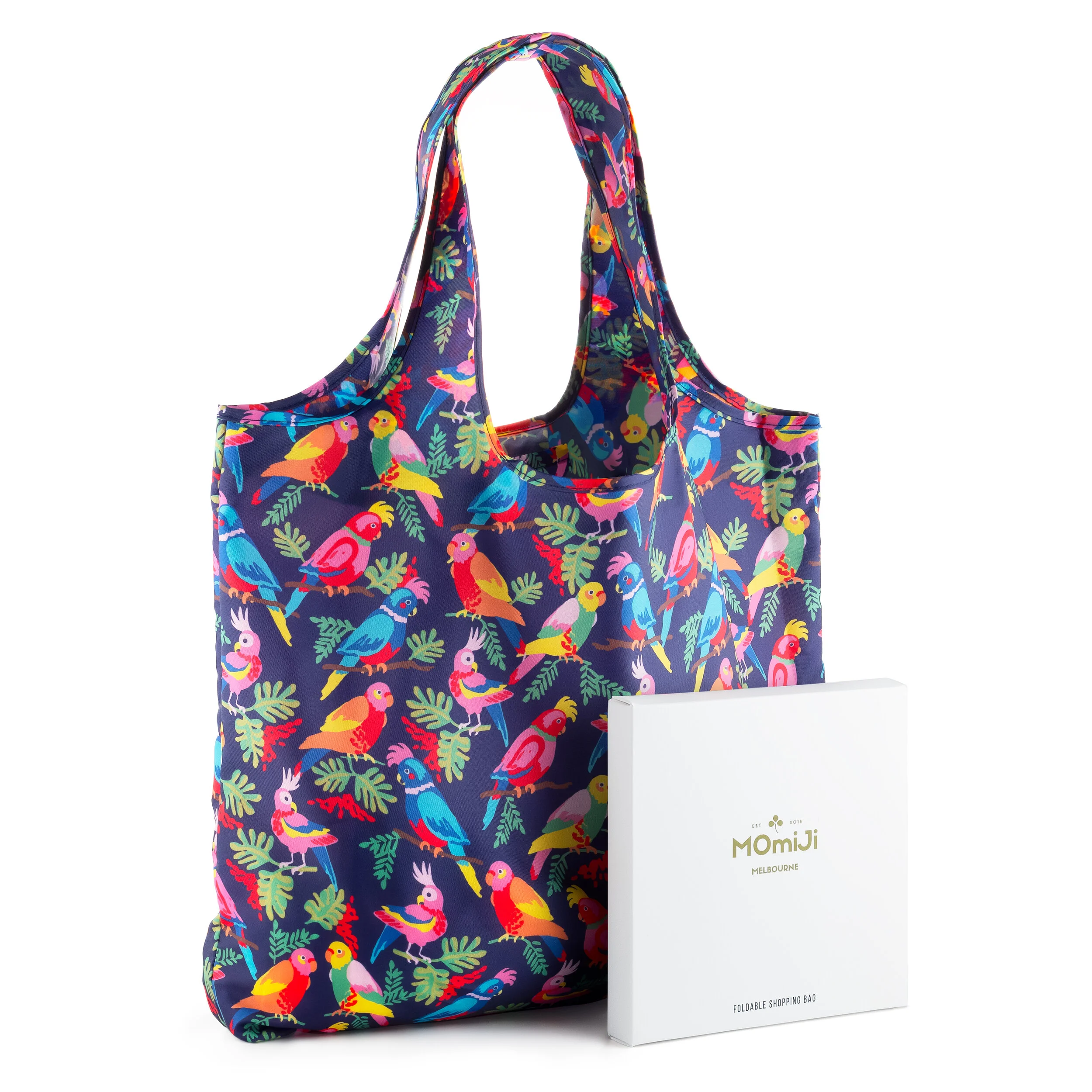
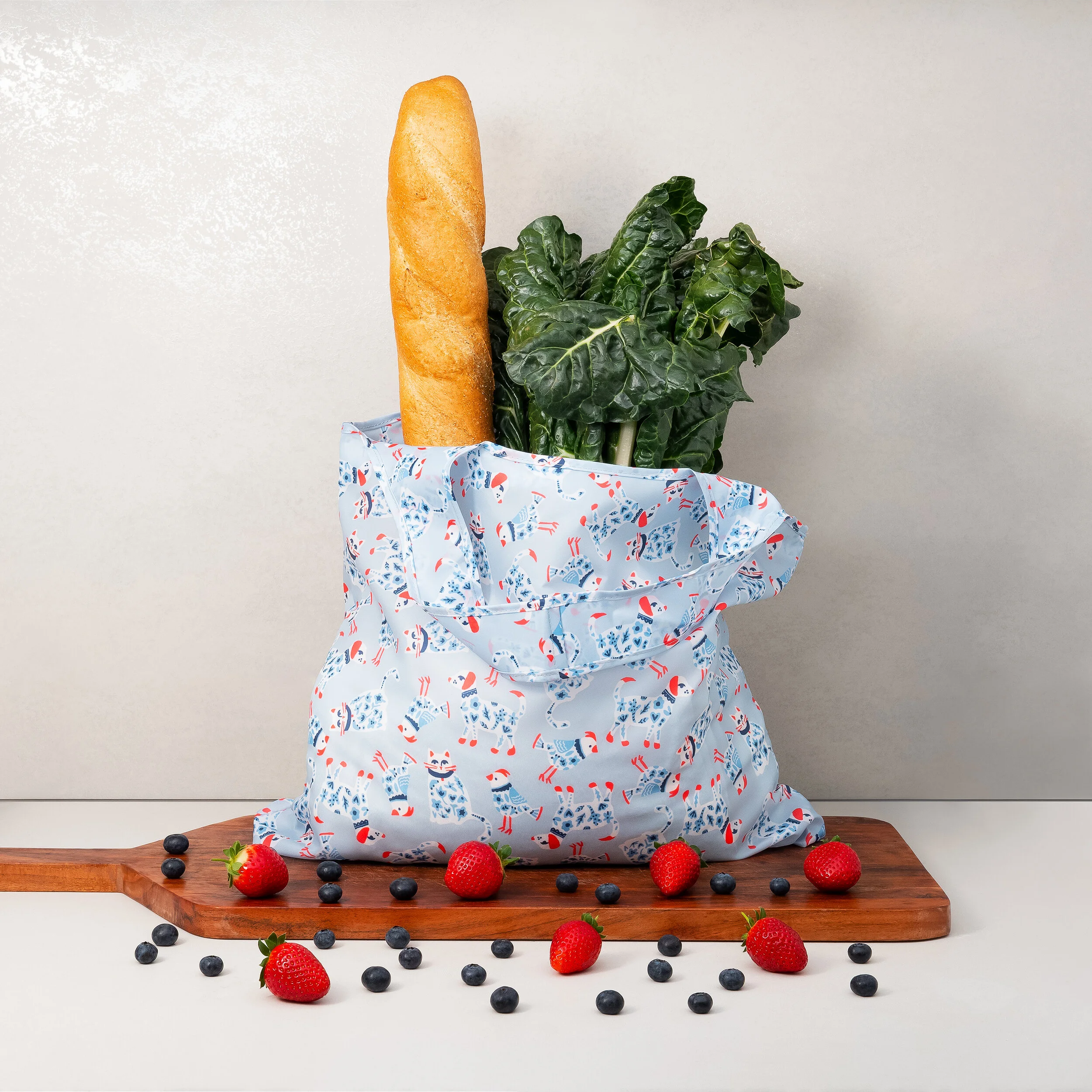
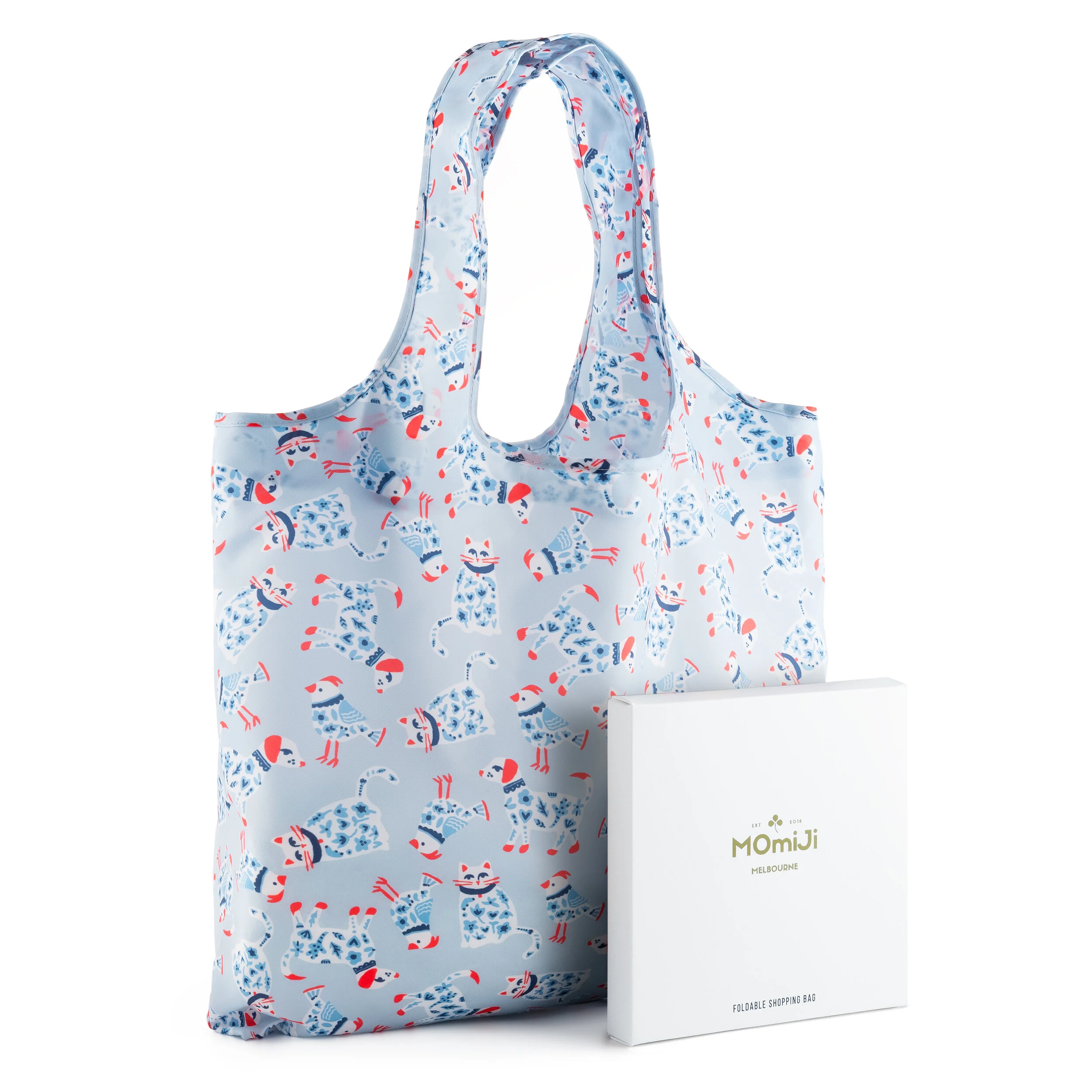
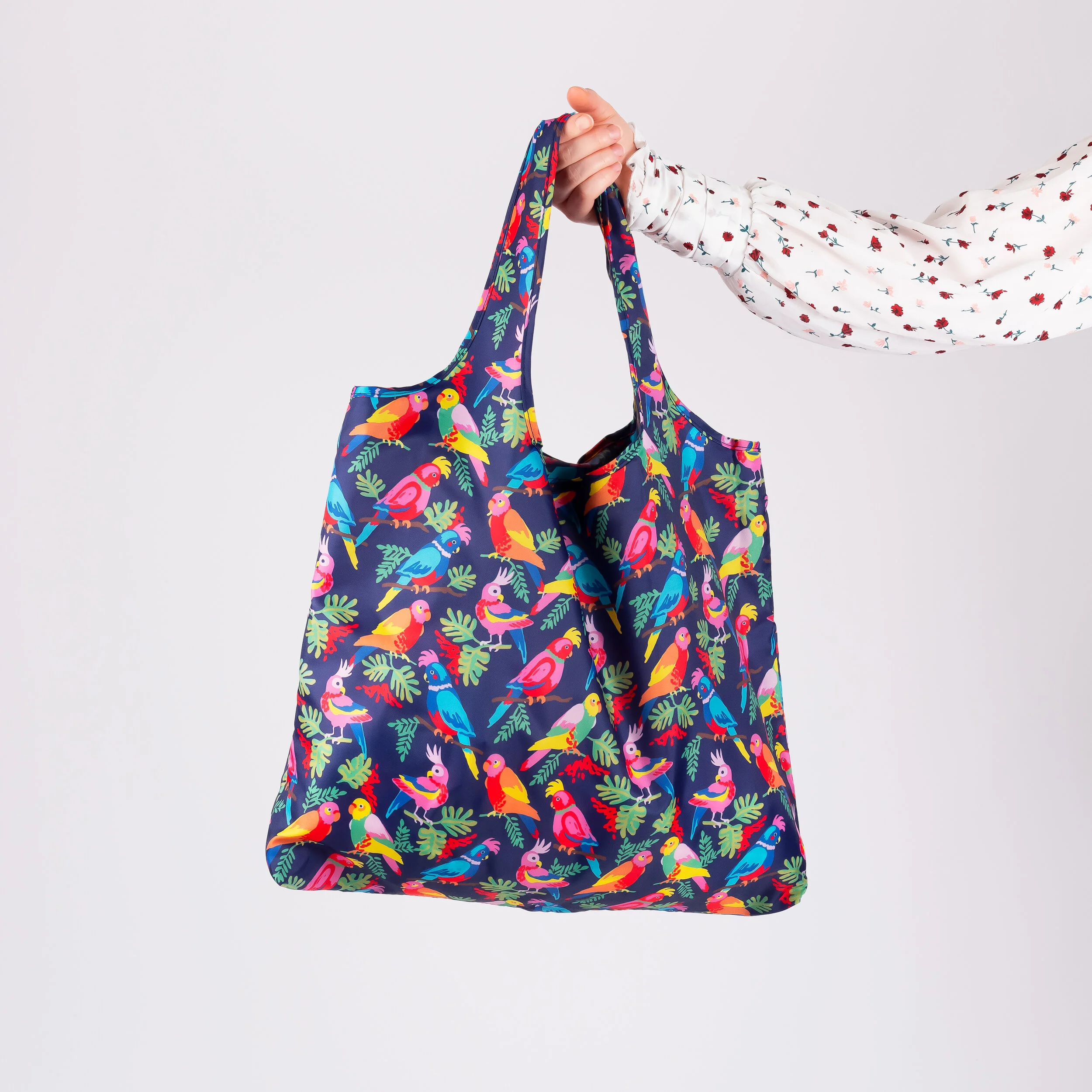
I am so happy to share this awesome collaboration I did with Momiji Melbourne. How cute are these eco-friendly bags made from recycled materials?! There are currently two different Katja designs available via their site: www.momijico.com. Take a look and get one for yourself and one for a friend.
Blue Print Show in SF October 1-3, 2019
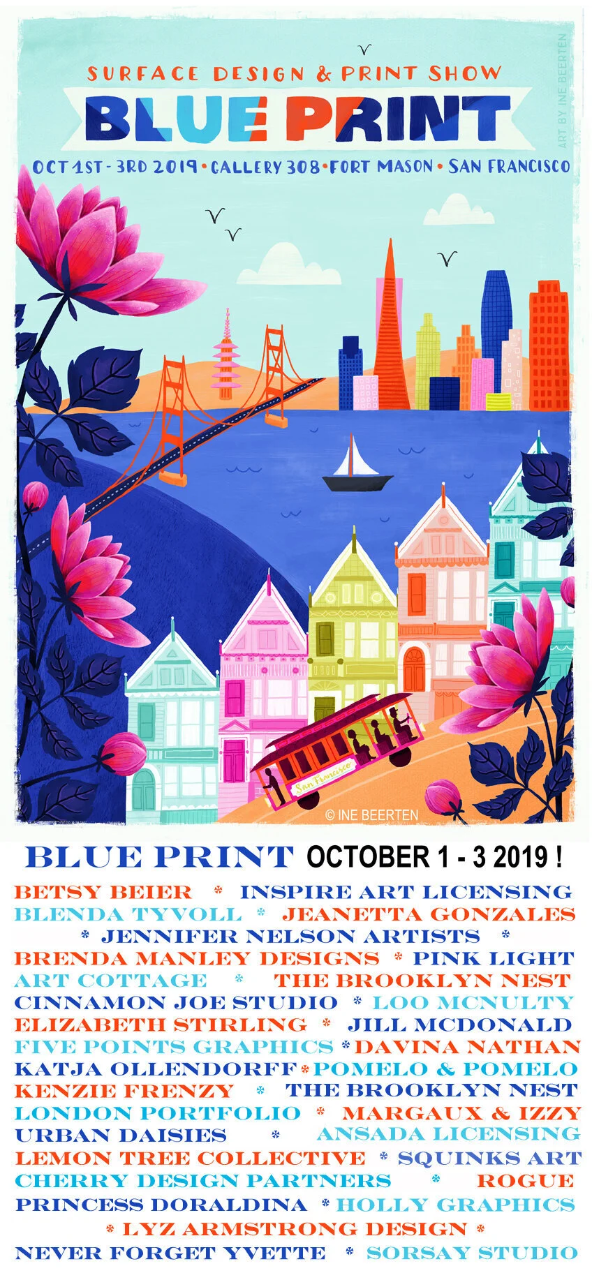
I’ll be exhibiting at the Blueprint Show in SF this year and I’m getting super excited for next week’s show. How could I not participate!? It’s right in my backyard!
This is the first time I’ll be sharing my designs at a print show, so I’m not 100% sure of what to expect, but I imagine I’m going to meet some really great people, and hope they like what I have to offer!
The show is primarily for industry people—buyers and agents and the like—but the public may also attend for a fee of $60.00. It runs for 3 days during the week Oct 1-3.
Gallery 308
Landmark Building A, 2 Marina Blvd.
San Francisco, CA 94123
10/1 & 10/2 9:30 - 6:00
10/3 9:30- 3:00
Maybe I’ll see you there!
—Katja
p.s. If you have ever wanted to showcase your work, and you missed the deadline for this one, do not despair…there is another SF show coming up in May 2020. Just submit an application!
Inspired by TV Textiles
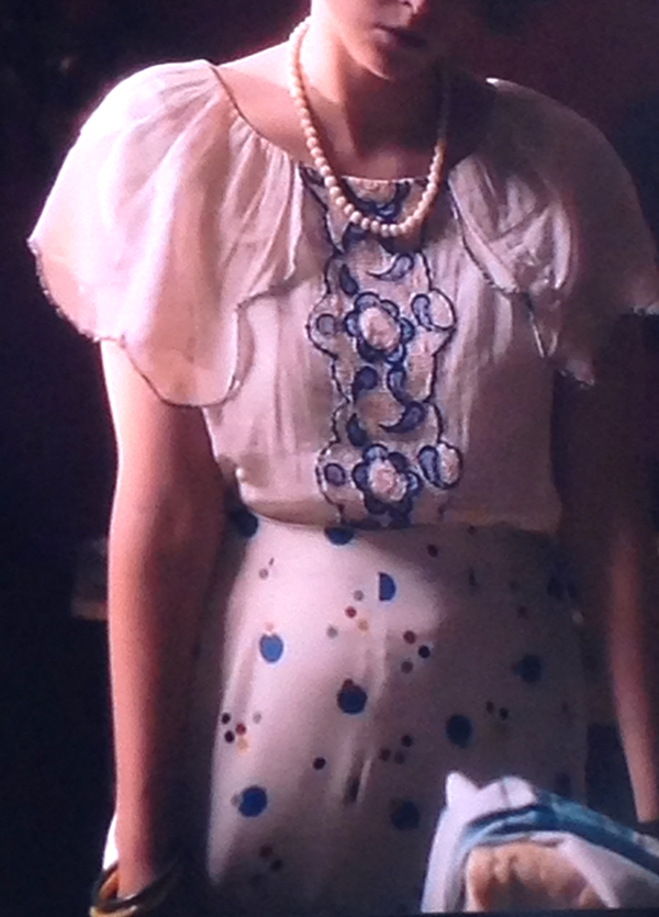
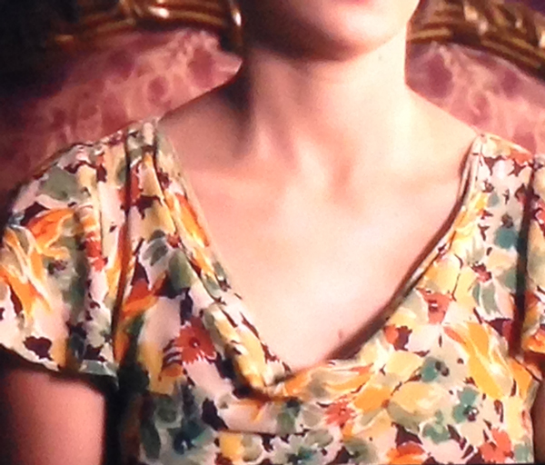
A lot of things inspire my designs. Being outside and walking around town or in nature are big sources of inspiration. But on days when I'm stuck inside or just enjoying some TV time all cozy on the couch, I still can't stop myself from noticing patterns wherever I look. I have even saved a few images over the years on my Instagram feed #tvtextiles.
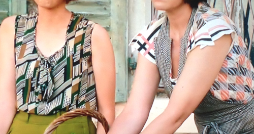
I love the series The Durells in Corfu (PBS Masterpiece Theater). It's set in 1935 and I am so in love with the fashion that is depicted on the show. I can't help but take snapshots of special patterns I notice as I watch. Afterward, I will look through the images and make little sketches to see a theme arise. Attached are (blurry) examples of my captures and the sketchbook entry, then design, that followed. Inspiration has no boundaries! What's your secret source of inspiration?
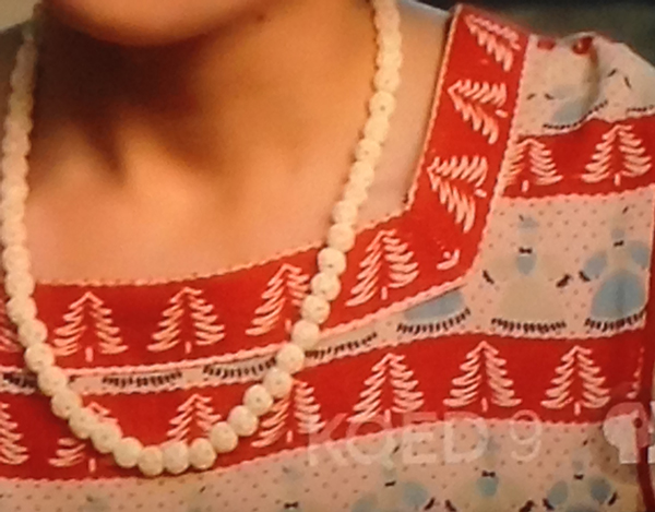
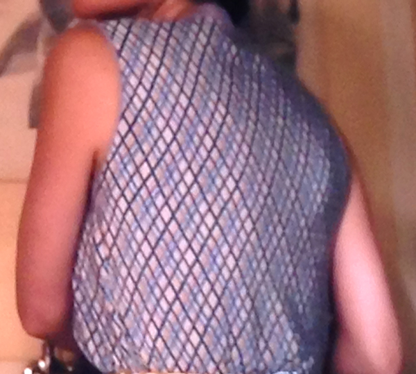
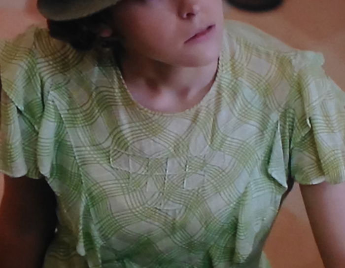
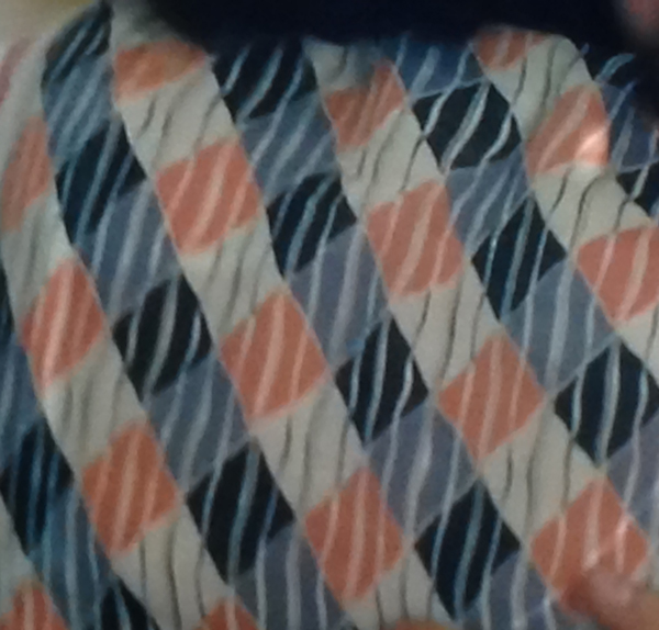
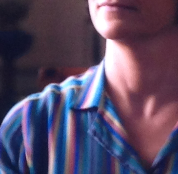

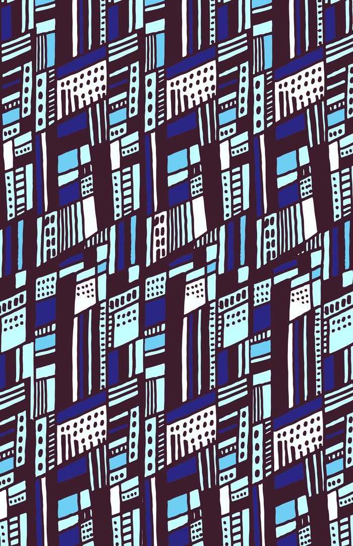
One of my inspired design
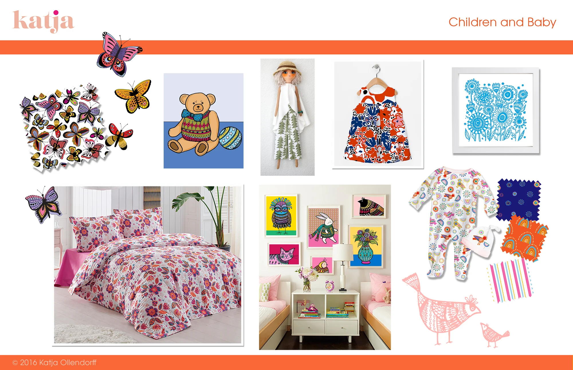
Do You Have a Bright Baby?
Smart, and bright too? I see lots of pastels out there, but I say energize your nursery or kid's room by integrating bold patterns and art. Contact me with queries about buying or licensing my designs, or to collaborate on a custom project. Keep on keeping it bright!
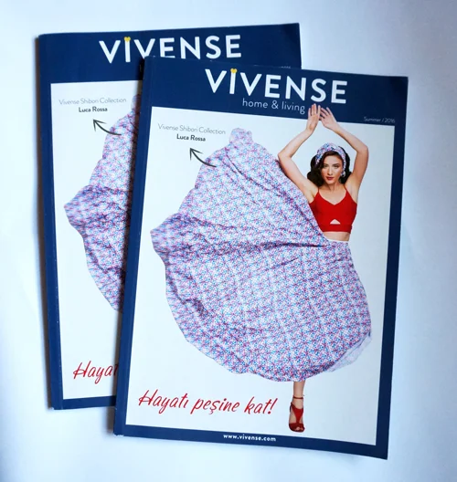
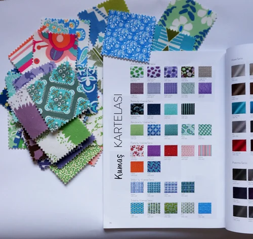
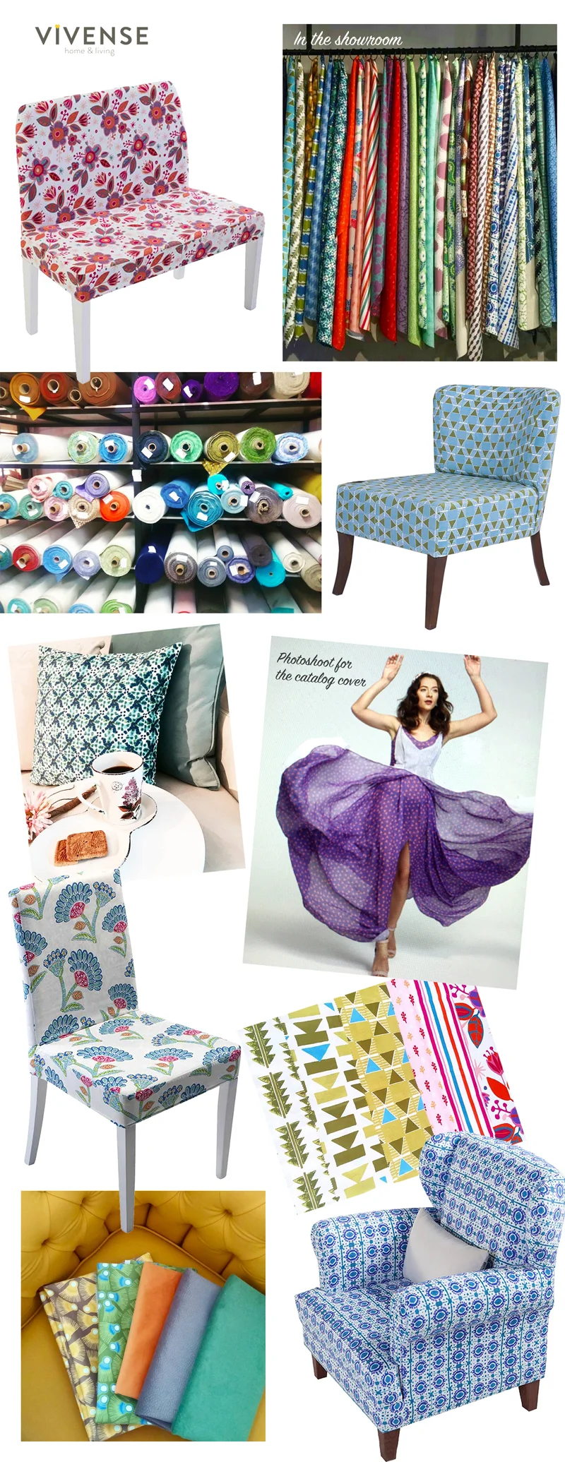
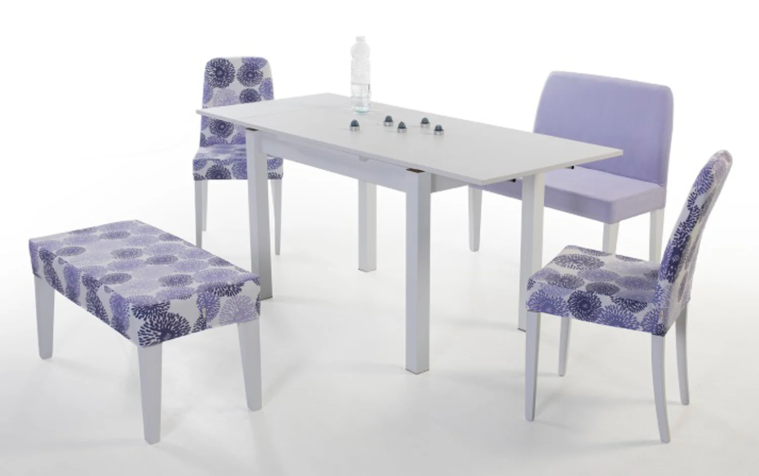
Vivense Home & Living
So very exciting to see my designs on both furniture and fabric for Vivense Home & Living. They are a wonderful modern furniture and lifestyle brand based in Istanbul, Turkey. It was a joy working with them to select these vibrant designs for their new home collections, which are now available on their website as well as in their showrooms. Here are just a few items available in store now.
New Products in my Shop
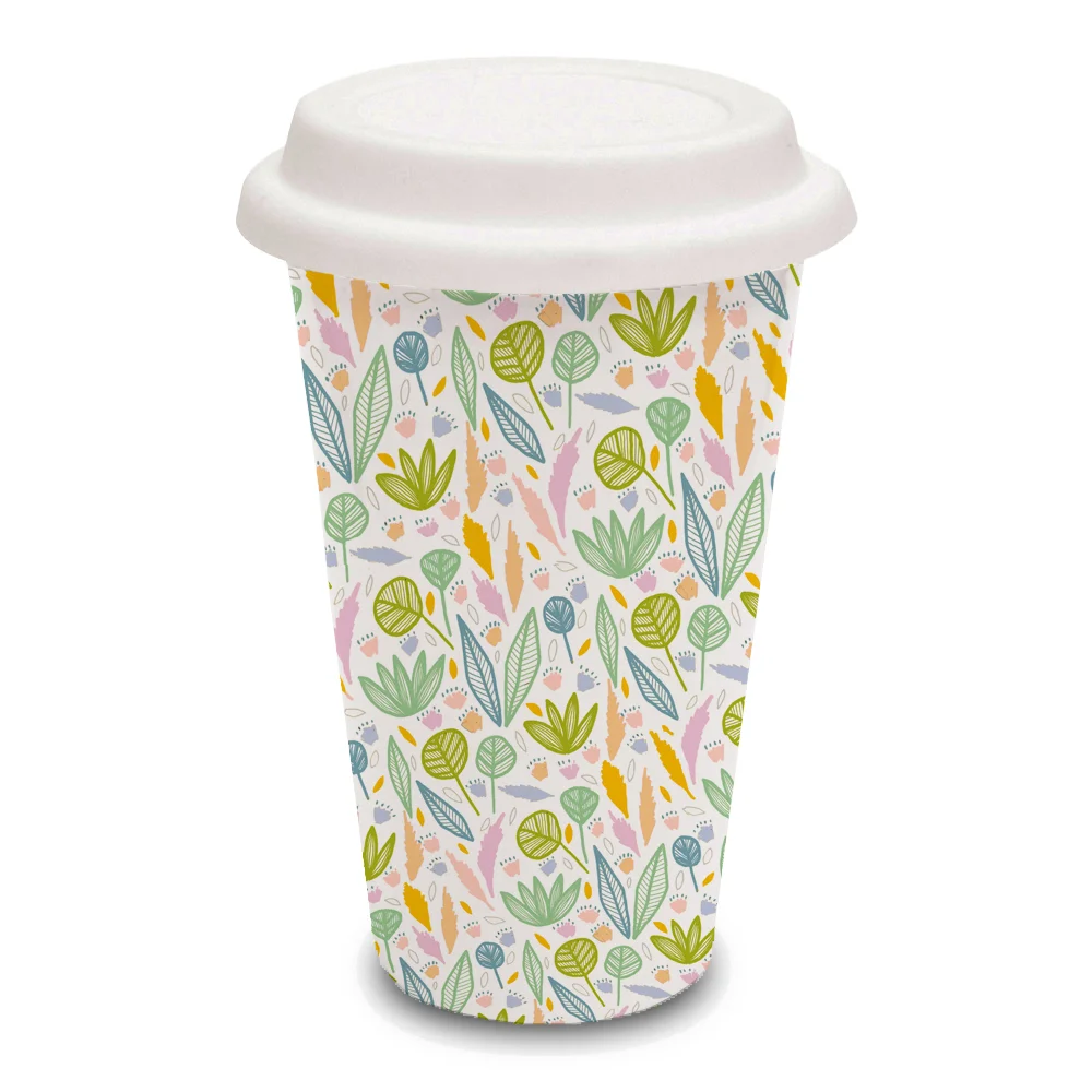
I am happy to announce that I have a whole slew of new products for sale on my site. Visit the SHOP tab to see what's in. I'm currently adding to my list of kitchen items which include coffee mugs, coasters and travel cups. Aprons, oven mitts and tea towels are soon to come.
Next up will be some great new accessories for the home including fabric, pillows and ready to hang artwork. So stayed tuned - there will be plenty available in time for the holidays. Wait what! Holidays? Well, it's never too soon.
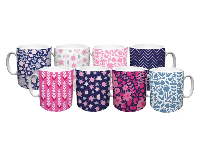
11 oz. and 15 oz. coffee mugs © Katja Ollendorff
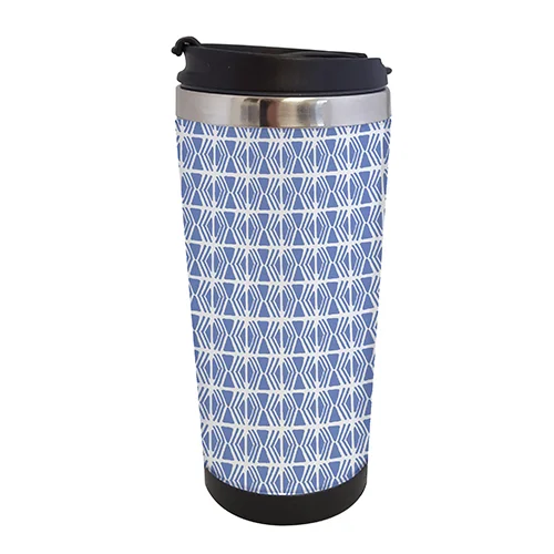
Travel cups and tumblers © Katja Ollendorff
© Katja Ollendorff
Coordinating set of coasters © Katja Ollendorff
Reflective Patterns
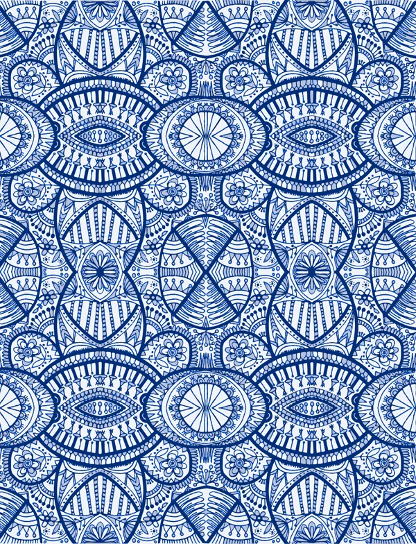
Some folks love either designing in repeat or putting designs into repeat, but I must admit it's not my favorite task. I'm much more of a free flow kind of person. But here is one easy way I can create a quick and interesting repeating pattern, that's different from the traditional square or half drop repeat. And if you are interested, you can watch a 15 minute video of me sketching what is to later become this beautiful decorative pattern.
It's pretty amazing how simple it is and it's fun too! It took me under an hour to create this pattern from start to finish. Of course I did a tiny bit of cleanup and if I were to do multiple colors, it would take longer, but after I did a live trace in Illustrator, I left the variations of gray because I liked the "antiqued" look that it created and that saved time.
Go to my Product Samples tab to see more reflective patterns that I have designed to be used as tablecloths.
Original scan
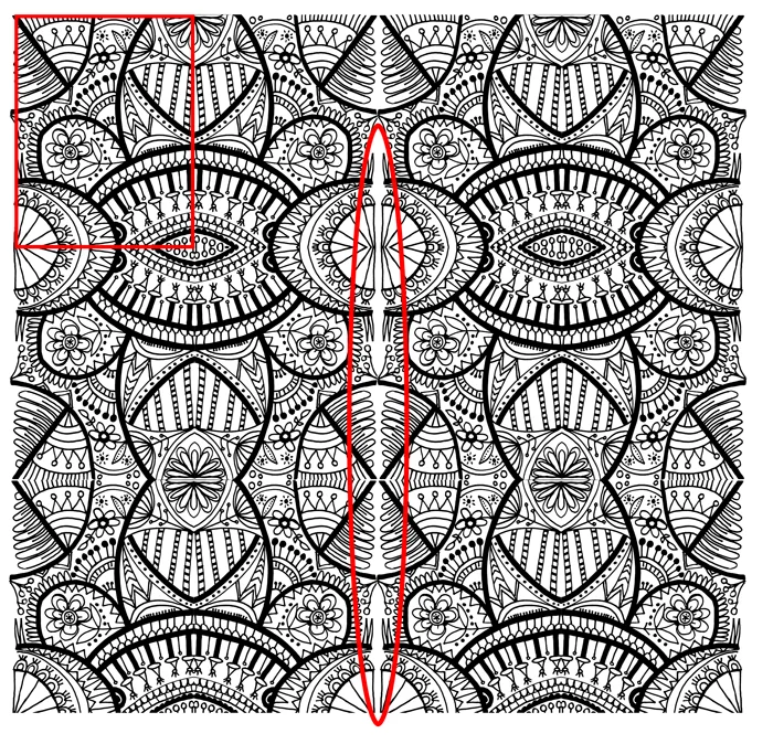
Clean up any gaps
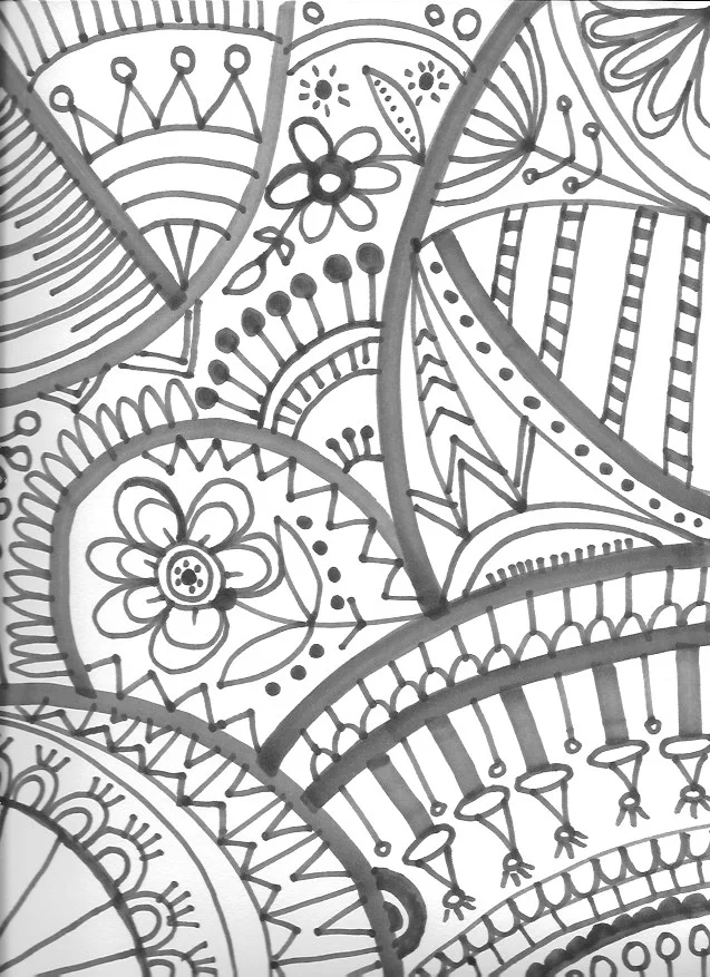
So to start, fill a page in your sketchbook with a design—of anything! The key is to have shapes running off the edges and corners so that they will join when flipped horizontally and vertically. Keep this in mind as you are drawing and try to envision what will happen when they are reversed and joined. It makes for less clean up down the road.
Next bring your sketch into Photoshop and flip and copy the image both horizontally and vertically on the top, bottom and sides. You may need to fill in and do slight adjustments at this point if there are any gaps or strange seams (see image below left).
That's it. You have yourself a cool reflective pattern that you can play with. Have fun!

Flip horizontally and then vertically
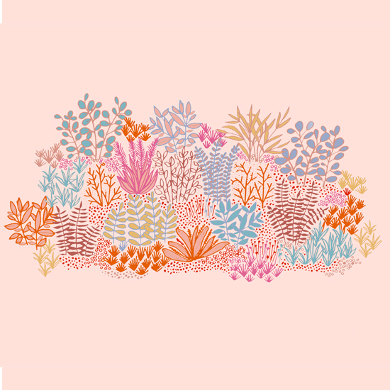
Nature Inspired
Since I've been working from home this past year, I sometimes get a bit str crazy. For me, the best solution for this is to get out into nature and fresh air. I decided to take a drive up to Mount Tamalpais yesterday morning. It was so refreshing! It's only 40 min from the city after all and it's really paradise on a weekday morning. Very few people are up there and I kinda love to be there as the fog lifts and reveals the amazing green hills and views below.
If you follow my two Instagram feeds (this one and this one) you might have seen a few pictures I posted. There were all sorts of sweet and colorful wildflowers all over the hills and they got me inspired to make this when I got home.

All designs and images © Katja Ollendorff
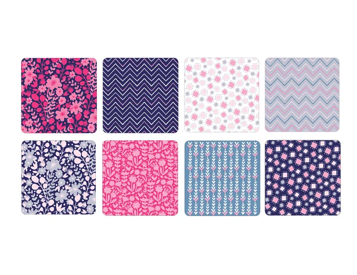
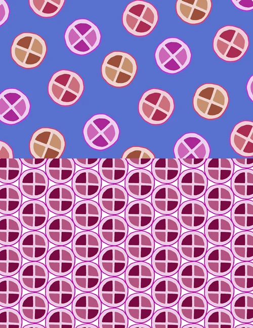
Color Changes Everything
Are you someone who...
- Mixes paint and chooses a palette before beginning a design?
- Uses reference material or an existing palette for inspiration?
- Just wings it and let's the design speak first and the colors follow?
I think lean toward #3 with a little #2 thrown in. I've heard that many people begin painting with a specific color palette in mind and let the colors guide the design. I personally like to design in black and white first. I almost never have a palette in mind until the layout is finished. Once I have the full design in front of me, colors just start appearing in my mind based on the kind of design I have created. I open up my swatch panel and really just start plugging them in as I begin to visual the end result. I never worry about the initial palette because I know I can always change it. Even if I paint something in color, I usually don't think too hard about the colors I put down.
Color can change the vibe of a design so much—I lean towards bold and bright colors, but that's just my personal aesthetic. If I have a client who is requesting a subtler color palette, I have to be able to change that design up to work for them too.
Here are some examples of how different a design can look when the palette is switched up for different uses. Which would you apply for wallpaper?Stationery? A shower curtain? The possibilities and uses are endless!
Minted and PBKids / PBTeen - Vote on February 19th!
Vote for my design on minted.™ see more from Katja Ollendorff vote for me!Check out my competition in Christmas photo cards and Save the Date cards at Minted. |
I've entered another contest through Minted.com—this time it's a collaboration with PBKids and PBTeen. My artwork is inspired by a trip to the San Francisco Botanical Gardens. Hope you like it! If you do, you can vote on February 19th. Click on the button to the right and rate my design a "5" to ensure a high vote tally for me. Thanks for supporting!
Putting Inspiration To Work
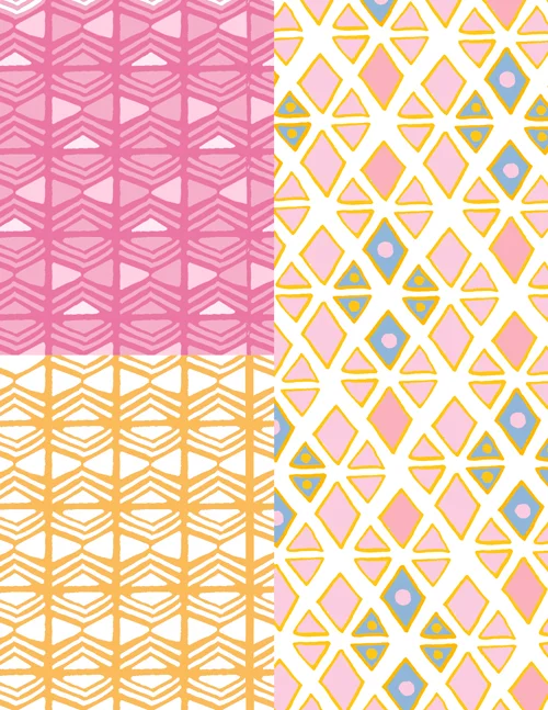
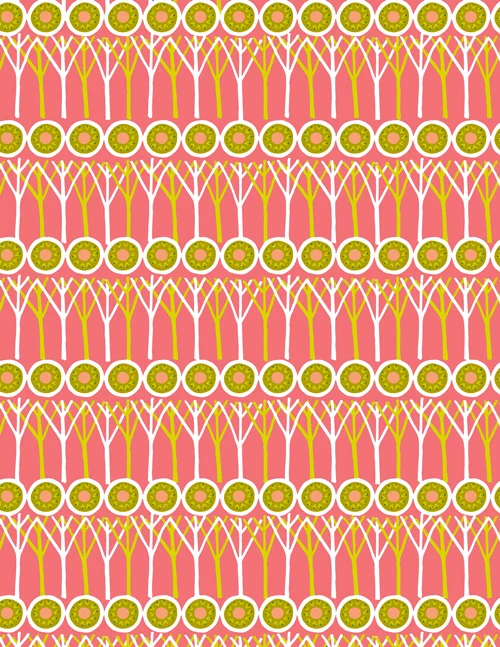
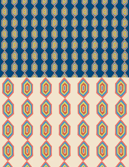
I often visit libraries and used bookstores in search of new inspiration. I found a few great books recently and wanted to share how I get inspired by imagery and designs, and then capture various motifs to make my own. I found this book on Erté by Charles Spencer at the Russian Hill Bookstore and found that it contained a huge amount of inspiration.
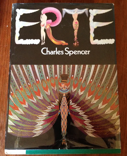
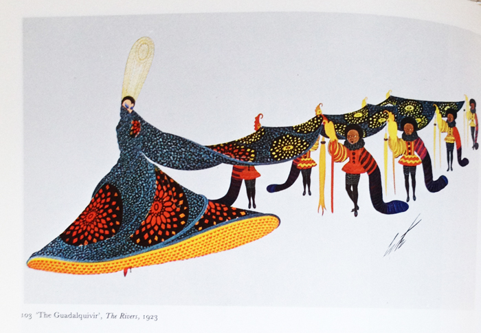
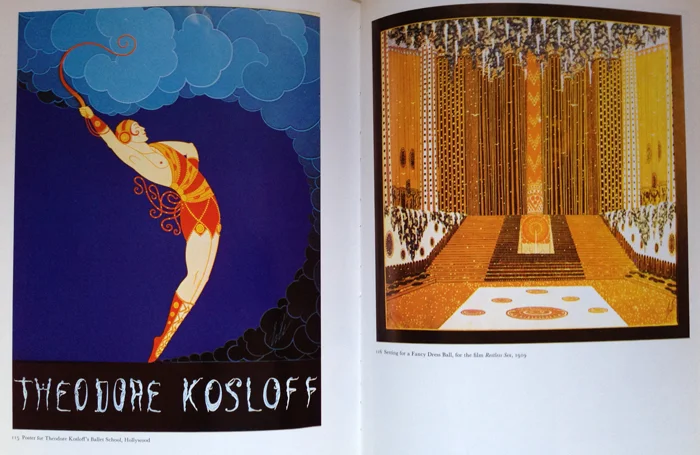
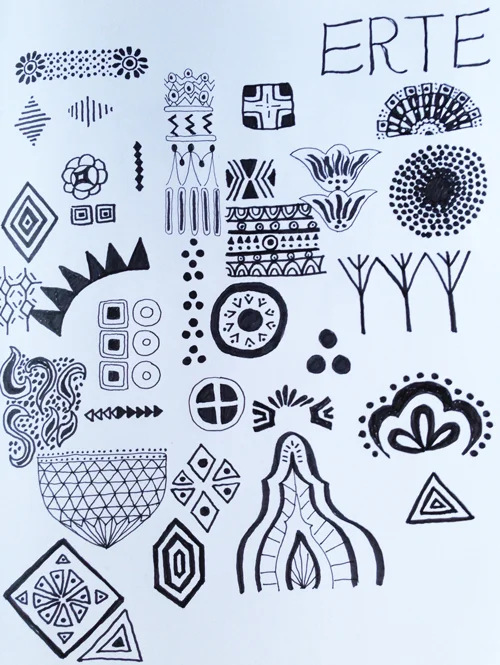
While flipping through it, I sat with my sketchbook and noted little details that spoke to me and my aesthetic. Once I have a selection of motifs I like to take a page from my sketchbook like the one here, into Photoshop and start playing with various items to see what I can come up with. I sometimes use individual motifs or combine a few—the possibilities are endless.
Can you tell which ones I used to make the patterns below? With color and scale changes, rotating, reflecting and putting my own spin on things, the designs now feel like mine but I know Erté was my inspiration and that's I nice thought. Because I did these designs in the same hand and used a complimentary color palette, they also feel like they could work as part of a collection.
I hope you have fun finding your own inspiration and putting it to work.
© 2016 Katja Ollendorff
© 2016 Katja Ollendorff
© 2016 Katja Ollendorff
© 2016 Katja Ollendorff
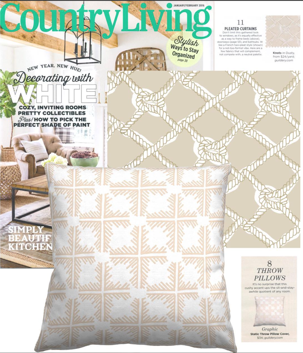
Latest Guildery Collection - Beaufort
On the heels of yesterday's CountryLiving feature, I have more Guildery news.
It's blue and green forever! Two of my all time favorite colors together in my latest collection Beaufort. I hope you enjoy all the new items that are now available on Guildery.com. You can always search KATJA and you'll find all of my collections in one spot! They recently added some new products such as wrapping paper and table linens. I ordered some paper for the holidays and it is GREAT quality. Go there and get thee some and enjoy!

Country Living Jan 2016 Feature
Woo wee! I just learned one of my designs (available on Guildery.com) was featured in the Jan/Feb 2016 Country Living Magazine. Pretty cool I say! I also used the same design (as a runner) up in Sonoma on my friend's table.
My Static design, here in Reverse Skin, is available on Guildery.com. There is a wide variety of colors and fabrics to choose from.
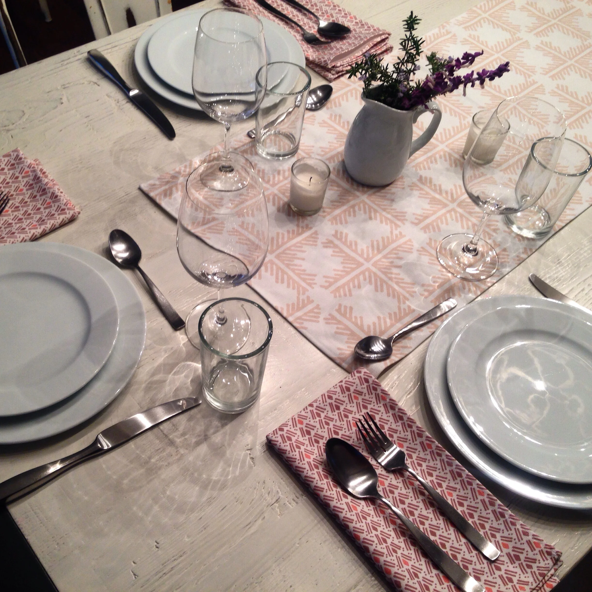
Static on the runner, and my Tepee design shown here on cloth napkins.
Make it in Design Interview →
I am so pleased to share an interview on Make It in Design's Blog this morning that features yours truly!
Click here to have a read.

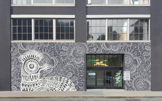
Minted - First Ever Outdoor Challenge
Hey Friends! I have entered the first ever outdoor challenge from Minted. The project was to design a mural for the front of their building in San Francisco. I'd love your vote for any or all of my 3 submissions to the right! You can click on each one and rate them 1 - 5.
Voting starts today. Please, click on the images here and vote for my Strange Bird murals (if you like them of course). Thank you so much! It would be so fun to win this one and see my art on a wall in the city.


Sky's the Limit
I once saw an HP ad that said "don't let your babies grow up to be jpegs." This is exactly the thought I have when I look at the gazillion photos stored in my computer. I have always tried to use my photos in a useful and creative way. These sky images were taken last week, all on the same night within a 20 minute timeframe.
I love how a pixelated, repeating pattern can be created and the fun is when you look at it up close and realize that each tiny square is a different sky.
Getting Loose
A few weeks ago, I spent an afternoon with some acrylic paint—something I hadn't pulled out in a while. I had fun making lots of splashes, daubs and strokes. This past week I spent time making some loose patterns using my playtime markings.


And here is the result of that playing. Some simple, yet bold designs in bright fruity colors.

Have bloomin' great day!
I woke up super early again and decided to do my "morning design flow" exercise. I get out my sketchbook first thing every day after waking to see what comes. I used to keep a dream journal, but now I'm letting my thoughts come out as designs. Here's what happened today.
At 6:00 AM I began sketching, and by 7:00 I had a motif I thought I could play with.


Then I brought the motif into Illustrator and did an image trace so the lines were nice and clean.
I dragged the motif into PS and worked on the layout and then the color.
A few hours later...and voila!
A pattern is born.

© Katja Ollendorff

© Katja Ollendorff
I couldn't help but make some coordinates to go along with the primary design. And then a gazillion color changes later... I landed here.
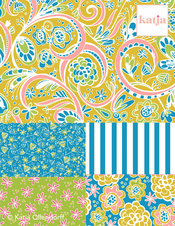
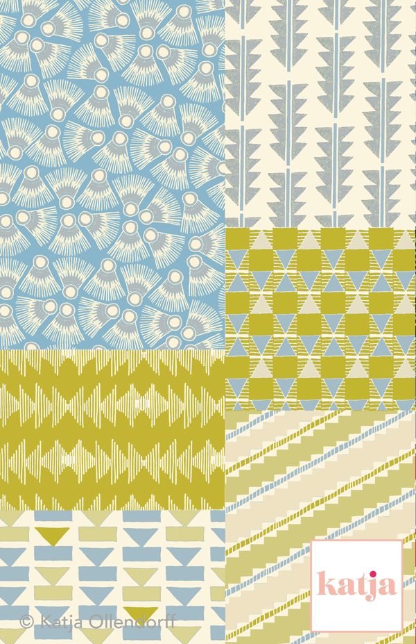
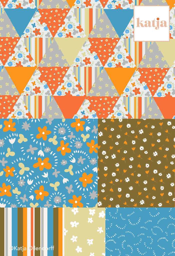
Collections
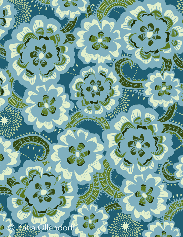
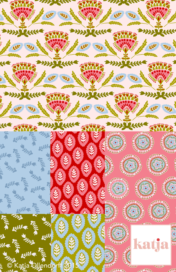
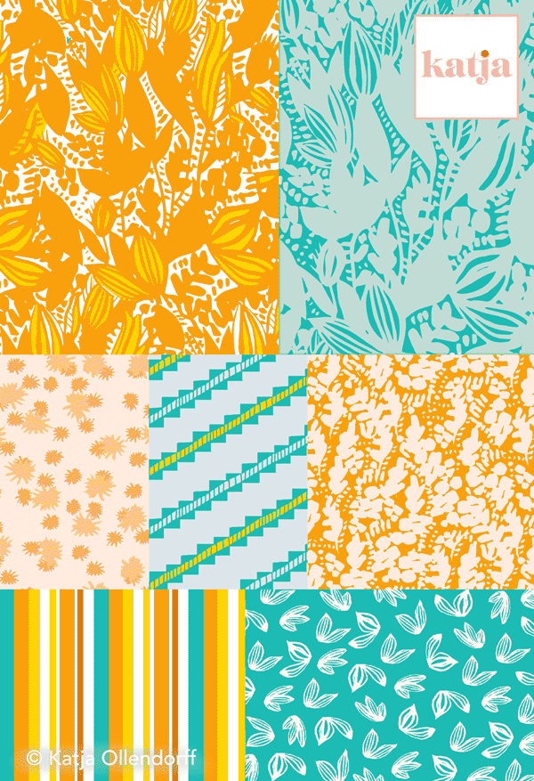
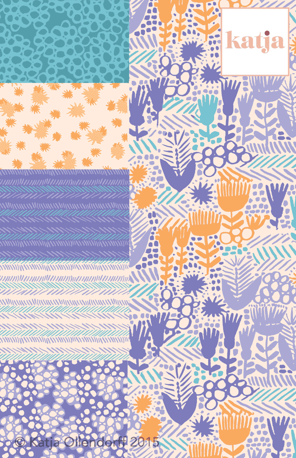
I like to change things up, so I'm always working on something different—experimenting with different mediums and painting techniques. I love to move from design to design, but sometimes I get swept away and need to remember to focus in on the bigger picture—and think about how the design could work as part of a collection.
This has been my focus this week as I go back through my individual designs to see which would be good candidates to elaborate on. I actually really enjoy doing this, I just don't do it enough.
Take a peek at a few collections I have put together. What do you think?
Letting It Flow in Black & White
The "letting it flow" piece.
I was in a bit of a creative slump so I decided to just sit with a large white page for a bit. Instead of worrying about a palette, I got out some black free-flowing acrylic (love that stuff!) and just filled a large round brush with it. I wanted to see what would happen if I approached a design with absolutely no intention—no aforethought as to what I wanted the design to become. Most times I go in with an idea or vision of what I want.
It felt really good to let the ink just flow on the page and see what would happen naturally. I had been using Sharpie's lately to draw motifs and it felt great to switch mediums and try something different. Something looser. Before I knew it, I had filled my page, and I was super pleased with the result. It actually got me excited to do more, so now I can confidently say my block is down!
Through this experiment for myself, I have learned that starting a design not thinking about the end result, allowed my inner creative voice do its thing. I urge you to try it the next time you don't think you have anything left in you, because I bet you do!